sparly
rebuilding trust in the onboarding of a swedish savings app.
the problem
people downloaded sparly but never signed up. most of them dropped off during onboarding, before connecting their bank.
what we found
after a lot of user testing, the idea wasn’t the issue, confidence was. people didn’t know where they were, how to move on, or why to trust the app with their bank.
clearer steps
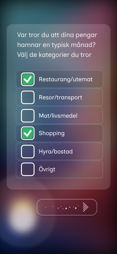
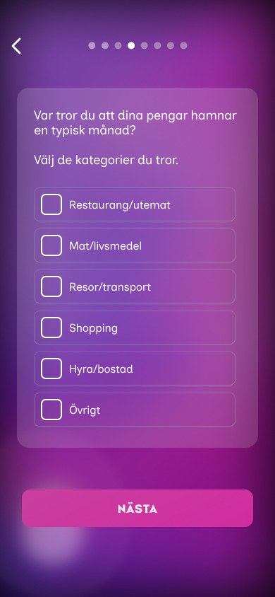
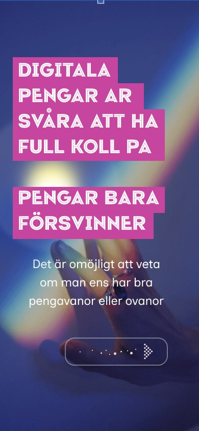
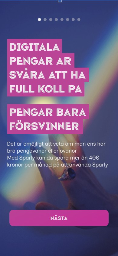
the swipe-style arrow confused people and there was no way back. we added a clear “nästa” button, a back button and progress dots.
trust before bankid
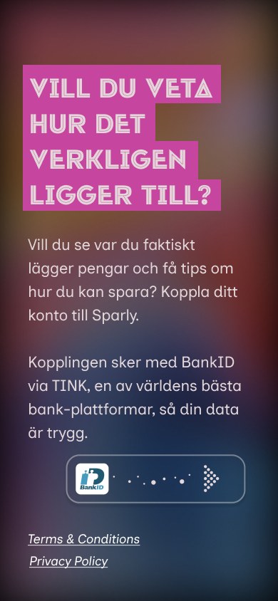
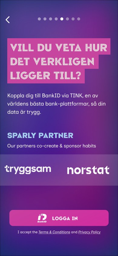
people felt unsure about connecting their bank. we added known partner logos, a familiar bankid button and a shorter explanation.
a shorter intro
testers skipped the long intro text, so we cut the story from four screens to two, with fewer words.
the result
in the second round of tests, people felt much safer, and all six testers we asked preferred the new button. much of the redesign shipped in the live app.
looking for a designer? i'd love to hear from you.